Part 1: Geo-spatial analysis with US Census data
The goal of this document is to show basic geo-spatial analysis in R. These plots or similar version of these plots were used to perform a basic corporate diligence looking at the general workforce metrics including the SAHIE insurance data and net migration. Together these can help provide an overall understanding of the average demographics of the population within a 45 mile radius (~1-1.5 hr by car) from the capital. This document is meant for education purposes only.
Document summary:
Performing basic geo-spatial analysis with US Census data.
Written by: Pete Skach and Eric W. Olle
CC-BY-SA license for the r-markdown document.
GPLv3 for the code.
No Warranty Provided
Created: Oct 2022
Edited for blog: October 25, 2022
The GitHub for this project contains the R-markdown and the data used to generate this blog. The data and the markdown document are CC-BY-SA.
Loading the packages required.
One item needed for the used prior to using the US Census API packages (tidycensus or ) is a API key. Please see the Kyle Walkers Tidycensus page for more information.
Once the packages are loaded the next step is to start on the data collection, plots and finally making a full figure.
Looking at net migration on a county level
In this first call the function get_estimates will be used to obtain the county level information on net migration to (+) or from (-) a county.
Once the basic migration data has been obtained from the US census summary tables, this can be summarized to create an insert into the graph. The county level spatial information will be used for other plots. The inclusion of county-line information with census-tract data allow for an easy comparison between the graphs.
sum_df <- net_migration %>%
    select(-geometry) %>%
    data.frame() %>%
    summarize(min = round(min(value),2),
              max = round(max(value), 2),
            mean = round(mean(value),2),
            median = round(median(value),2),
            sd =  round(sd(value),2))

knitr::kable(sum_df)
| min | max | mean | median | sd |
|---|---|---|---|---|
| -24.72 | 13.66 | -5.35 | -4.85 | 6.51 |
net_migration %>%
    ggplot(aes(fill = value)) +
    geom_sf(color = "white") +
    theme_void() +
    geom_point(color = "Black",
               aes(x = -81.626500, y = 38.347410, group = NULL)) +
    geom_polygon(data =  charls$circle, aes(lon, lat), inherit.aes=FALSE, color = "black", alpha = 0) +
    scale_fill_viridis_c(option = "turbo")  +
    theme(plot.title = element_text(hjust = 0.5),
          plot.subtitle = element_text(hjust = 0.5)) +
    labs(title = "Migration Rate per 100,000",
         fill = "Migration") +
    annotate(geom = "table", x = -83, y  = 36.5, label = list(sum_df),
             vjust = 0, hjust = 0, size = 2) -> migration

migration
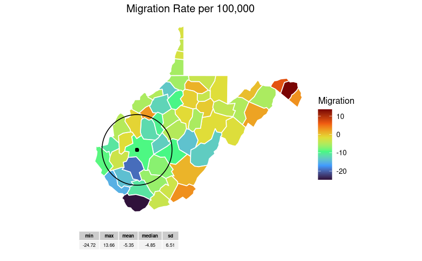
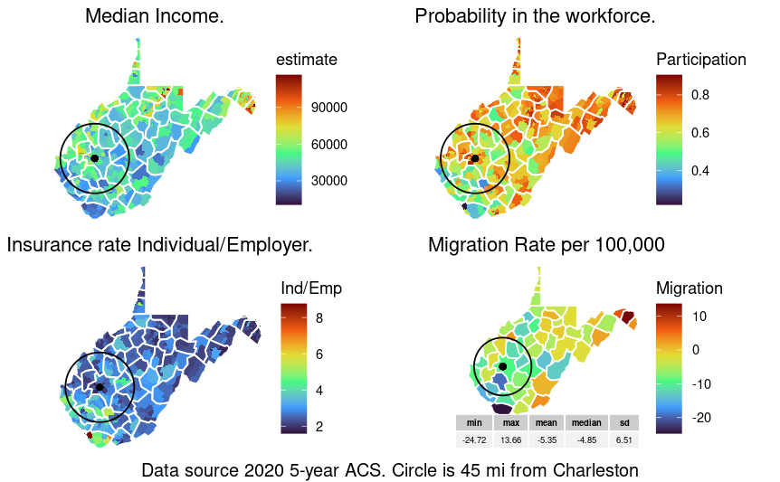
This plot shows the overall migration to (+) and from (-) the different counties in WV. The summary table shows the overall distribution of the county migration.
Overall workforce participation
The next plot will concentration on the number of people between 18-64 that are employed full-time as a ratio to the total population to estimate workforce participation. This is different from unemployment.
## Getting data from the 2016-2020 5-year ACS
## Using FIPS code '54' for state 'WV'
WV_employ  %>%
    ggplot(aes(fill = pct_labor_partic)) +
    geom_sf(color = NA) +
    geom_sf(data = net_migration, color = "white", fill = NA, inherit.aes = FALSE) +
    theme_void() +
    scale_fill_viridis_c(option = "turbo") +
    geom_point(color = "black",
               aes(x = -81.626500, y = 38.347410, group = NULL), alpha = .2) +
    geom_polygon(data =  charls$circle, aes(lon, lat), inherit.aes=FALSE, color = "black", alpha = 0) +
    theme(plot.title = element_text(hjust = 0.5),
          plot.subtitle = element_text(hjust = 0.5)) +
    labs(title = "Probability in the workforce.",
         fill = "Participation") -> wkfrce_partic

wkfrce_partic
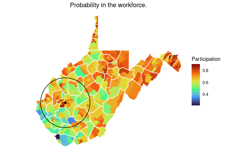
The above plot shows the overall full-time workforce participation. This data looks at eh 18-64 year old demographics and may underestimate total participation in the workforce. In some of the southern WV counties, there is a higher than average participation in the 65 and older group.
Income data
The next graph will look at the median income on a census tract level.
## Getting data from the 2016-2020 5-year ACS
## Using FIPS code '54' for state 'WV'
Once the income data is obtained next is to plot in a format similar to above.
WV_income %>%
  ggplot(aes(fill = estimate)) +
  geom_sf(color = NA) +
  geom_sf(data = net_migration, color = "white", fill = NA, inherit.aes = FALSE) +
  theme_void() +
  geom_point(color = "black",
               aes(x = -81.626500, y = 38.347410, group = NULL), alpha = .2) +
  geom_polygon(data =  charls$circle, aes(lon, lat), inherit.aes=FALSE, color = "black", alpha = 0) +
  scale_fill_viridis_c(option = "turbo") +
  theme(plot.title = element_text(hjust = 0.5),
          plot.subtitle = element_text(hjust = 0.5)) +
  labs(title = "Median Income.") -> median_income

median_income
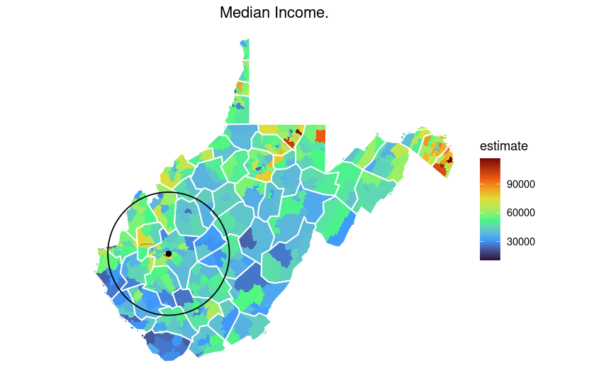
This shows the median income by census tract with county-line shown in white. On average, WV is below the national median.
Ratio of Individual versus Employer provided health insurance
Finally, the final graph before making a aggregated figure is to look at the ratio of individual provided versus employer provided health insurance coverage. This can be an indicator for a large number of part-time jobs that provide enough income to not qualify for medicaid but do not provide health insurance benefits.
WV_healt_ins <- get_acs(
  state = "WV",
  geography = "tract",
  variables = c(Employer = "C24050_001E",
                Ind_purch  = "C27005_001E"),
  geometry = TRUE,
  output = "wide",
  year = 2020
)
## Getting data from the 2016-2020 5-year ACS
## Using FIPS code '54' for state 'WV'
This time the ggplots ability to calculate the ratio by row will be used.
WV_healt_ins %>%
    ggplot(aes(fill = Ind_purch/Employer)) +
    geom_sf(color = NA) +
    geom_sf(data = net_migration, color = "white", fill = NA, inherit.aes = FALSE) +
    theme_void() +
    geom_point(color = "black",
               aes(x = -81.626500, y = 38.347410, group = NULL), alpha = 0.2) +
    geom_polygon(data =  data.frame(charls), aes(circle.lon, circle.lat), inherit.aes=FALSE, color = "black", alpha = 0) +
    scale_fill_viridis_c(option = "turbo")  +
    theme(plot.title = element_text(hjust = 0.5),
          plot.subtitle = element_text(hjust = 0.5)) +
        labs(title = "Insurance rate Individual/Employer.",
         fill = "Ind/Emp") -> ins_source

ins_source
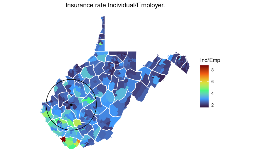
The above plot shows that on average there is a higher rate of individual provide health insurance in the southern side of the state.
Putting four plots together.
Finally, the plots will be arrange into a single plot using ggpubr.
 ggarrange(median_income, wkfrce_partic, ins_source, migration,
           nrow = 2, ncol =2, align = "none") %>%
  annotate_figure(., bottom = text_grob("Data source 2020 5-year ACS. Circle is 45 mi from Charleston"))
Conclusion
The tidycensus package combined with ggplot2 can be a useful tool for basic geospatial analysis. In the next blog, how to make a pseudo-3d plot and stack the figures will be shown.
## R version 4.2.1 (2022-06-23)
## Platform: x86_64-pc-linux-gnu (64-bit)
## Running under: Pop!_OS 20.04 LTS
##
## Matrix products: default
## BLAS:   /usr/lib/x86_64-linux-gnu/openblas-pthread/libblas.so.3
## LAPACK: /usr/lib/x86_64-linux-gnu/openblas-pthread/liblapack.so.3
##
## locale:
##  [1] LC_CTYPE=en_US.UTF-8       LC_NUMERIC=C
##  [3] LC_TIME=en_US.UTF-8        LC_COLLATE=en_US.UTF-8
##  [5] LC_MONETARY=en_US.UTF-8    LC_MESSAGES=en_US.UTF-8
##  [7] LC_PAPER=en_US.UTF-8       LC_NAME=C
##  [9] LC_ADDRESS=C               LC_TELEPHONE=C
## [11] LC_MEASUREMENT=en_US.UTF-8 LC_IDENTIFICATION=C
##
## attached base packages:
## [1] stats     graphics  grDevices utils     datasets  methods   base
##
## other attached packages:
##  [1] knitr_1.39       RWordPress_0.2-3 ggpmisc_0.5.0    ggpp_0.4.5
##  [5] magrittr_2.0.3   ggpubr_0.4.0     tigris_1.6.1     forcats_0.5.1
##  [9] stringr_1.4.0    dplyr_1.0.9      purrr_0.3.4      readr_2.1.2
## [13] tidyr_1.2.0      tibble_3.1.7     ggplot2_3.3.6    tidyverse_1.3.1
## [17] tidycensus_1.2.2 geosphere_1.5-14
##
## loaded via a namespace (and not attached):
##  [1] bitops_1.0-7       fs_1.5.2           sf_1.0-7           lubridate_1.8.0
##  [5] httr_1.4.3         gh_1.3.0           tools_4.2.1        backports_1.4.1
##  [9] utf8_1.2.2         rgdal_1.5-32       R6_2.5.1           KernSmooth_2.23-20
## [13] DBI_1.1.3          colorspace_2.0-3   withr_2.5.0        sp_1.5-0
## [17] tidyselect_1.1.2   gridExtra_2.3      curl_4.3.2         compiler_4.2.1
## [21] cli_3.3.0          rvest_1.0.2        quantreg_5.93      SparseM_1.81
## [25] xml2_1.3.3         labeling_0.4.2     scales_1.2.0       classInt_0.4-7
## [29] proxy_0.4-27       rappdirs_0.3.3     digest_0.6.29      foreign_0.8-82
## [33] pkgconfig_2.0.3    highr_0.9          dbplyr_2.2.1       rlang_1.0.4
## [37] readxl_1.4.0       XMLRPC_0.3-1       rstudioapi_0.13    farver_2.1.1
## [41] generics_0.1.3     jsonlite_1.8.0     car_3.1-0          RCurl_1.98-1.8
## [45] s2_1.0.7           Matrix_1.5-1       Rcpp_1.0.9         munsell_0.5.0
## [49] fansi_1.0.3        abind_1.4-5        lifecycle_1.0.1    yaml_2.3.5
## [53] stringi_1.7.8      carData_3.0-5      MASS_7.3-58.1      grid_4.2.1
## [57] maptools_1.1-4     crayon_1.5.1       lattice_0.20-45    haven_2.5.0
## [61] cowplot_1.1.1      splines_4.2.1      hms_1.1.1          pillar_1.7.0
## [65] uuid_1.1-0         markdown_1.1       ggsignif_0.6.3     XML_3.99-0.10
## [69] wk_0.6.0           reprex_2.0.1       glue_1.6.2         evaluate_0.15
## [73] modelr_0.1.8       vctrs_0.4.1        tzdb_0.3.0         MatrixModels_0.5-0
## [77] cellranger_1.1.0   gtable_0.3.0       assertthat_0.2.1   xfun_0.31
## [81] mime_0.12          broom_1.0.0        gitcreds_0.1.2     e1071_1.7-11
## [85] rstatix_0.7.0      class_7.3-20       survival_3.4-0     viridisLite_0.4.0
## [89] units_0.8-0        ellipsis_0.3.2
References
Aphalo P (2022). ggpp: Grammar Extensions to ‘ggplot2’. R package version 0.4.5,
https://CRAN.R-project.org/package=ggpp.
Aphalo P (2022). ggpmisc: Miscellaneous Extensions to ‘ggplot2’. R package version 0.5.0,
https://CRAN.R-project.org/package=ggpmisc.
Bache S, Wickham H (2022). magrittr: A Forward-Pipe Operator for R. R package version 2.0.3,
https://CRAN.R-project.org/package=magrittr.
Kassambara A (2020). ggpubr: ‘ggplot2’ Based Publication Ready Plots. R package version
0.4.0, https://CRAN.R-project.org/package=ggpubr.
Hijmans R (2021). geosphere: Spherical Trigonometry. R package version 1.5-14,
https://CRAN.R-project.org/package=geosphere.
Walker K (2022). tigris: Load Census TIGER/Line Shapefiles. R package version 1.6.1,
https://CRAN.R-project.org/package=tigris.
Walker K, Herman M (2022). tidycensus: Load US Census Boundary and Attribute Data as
‘tidyverse’ and ‘sf’-Ready Data Frames. R package version 1.2.2,
https://CRAN.R-project.org/package=tidycensus.
Wickham et al., (2019). Welcome to the tidyverse. Journal of Open Source Software, 4(43), 1686,
https://doi.org/10.21105/joss.01686